This chart shows covid case data over time with interactive choice of region from the Rapid Charts website
This is a live chart using an api from the government covid website; it will auto update as the page opens
This chart uses the same data but is focused on different regions and uses a csv file dowloaded straight onto GitHub, so will not auto update
This chart uses a subsection of data from chart 4 and was manually inputted into Vega-Lite to make the chart
This chart uses manually manipulated data, starting with GDP and poulation data for Denmark to form GDP per capita
The next two charts are apis with live updating data
This next chart uses an api that needed to be manipulated in Google colab
Python code for tfl apiThis next chart also needed to be manipulated in Google colab as the api only allowed one page vewing at a time
Python code for TMDB apiThe next four charts are downloaded from 1 api using a loop in python
This next graph uses data scraped from UEFA
Dimitri Zenghelis of the LSE argued in a talk about the climate crisis that since the 1980s the UK and US has engaged in a smaller government, more free market approach to policy. This graph supports this argument; a falling corporation tax indicates lower government intervention on markets.
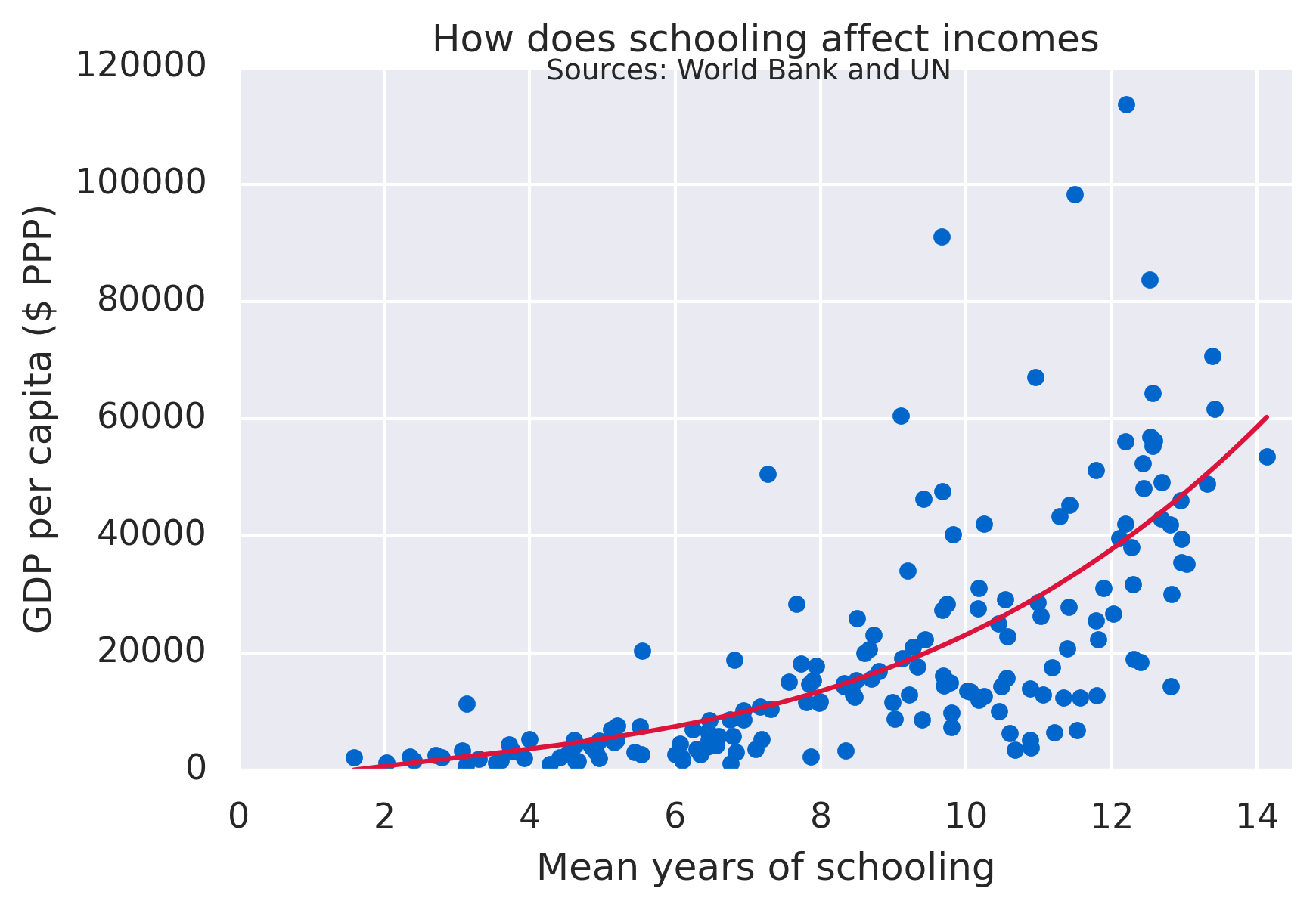
This next chart is a regression performed using python
The next two charts are interactive